HSBC Deceased Estate Management App
This project focuses on designing a user-centric UX solution for HSBC's deceased estate process through a mobile app.
Industry
Finance, banking.
Location
Sydney, Australia.
Date
Sep–Nov 2024
Role
UX/UI Designer
Overview
The HSBC Deceased State Management app focuses on designing a user-centric UX solution for HSBC's deceased estate process - that being the process where one contacts a bank in order to finalise and close off the account/estate of another who has passed away. The focus is on creating a compassionate and seamless user journey that aligns with the brand, especially during the challenging times of handling a loved one's passing.
A “Blue Sky” approach was encouraged which meant designing a whole new process could include, but not limited to, integrating the HSBC mobile app into the process, reimagining document management, or exploring other innovative solutions.
Background
HSBC is a global banking and financial services organisation operating in 64 countries, with HSBC Australia providing a comprehensive range of financial services across 45 branches and offices since 1965. Learn more about HSBC Australia.
This project had to be completed in just 7 weeks.
Project Goals
Since considering the timing of this project, and the fact there was a team of us acting independently, we had the choice to focus on 2 of the 4 project goals:
1.
Initial interaction and onboarding redesign ○ Streamline and enhance the user experience for reporting a customer’s death, converting the current process into a more user-friendly online system, including: ○ First Touchpoint: Currently begins with the "Dealing with Bereavement" page, which needs improvement for clarity and user support. ○ Death Reporting: Handled via the "Deceased Customer Notification" form, which should be transformed into a streamlined, fully digital process that is simple and efficient.
2.
Case Management system ○ Design a system that clearly communicates the user's current status in the process, outlines the next steps, and highlights any required actions. The implementation approach is flexible, one solution may be a customer porta ○ Inspiration: Consider systems like Amazon's case management, which effective tracks and notifies users about the status of their requests
3.
Alerts and Notifications ○ Implement a system for alerts and notifications to keep customers informed updates from HSBC ○ Alert channels: Customer portal and emails. Students can explore with the customer if the HSBC app can also be leveraged for alerts and notification ○ Examples: document arrivals, and various process approvals
4.
Document Management ○ Simplify the document submission process. ○ Increase the visibility of submitted documents. ○ Provide insights about the status of submitted documents (e.g. Submitted, Reviewed, approved etc). ○ Clarify what documents remain to be submitted.
I had selected goals 3 and 4.
Why?
1. The stakeholder interview revealed that the process behind goal 3 and 4 essential goes hand-in-hand, and was fitting to incorporate both in a single solution.
2. The primary assumption gathered from the interview was that all key stakeholders did not have any transparency or clarity into the progress of an application. Skip to interview insights.
Other questions I had asked myself at this stage ● Had there been any changes to the end to end process? ● What were the main concerns voiced by customers AND employees? ● What were the applications the team/s currently use, and what can a customer get access to? E.g. online portal/HSBC app? → Sometimes I can get too practical too quickly, I always find something considering WHO needs to use what and how difficult a new application or program is to implement. ● Who was most likely to contact on behalf of the deceased? Spouse, children, siblings? → thinking about users with and without technical fluency. ● Did the team have a low/high turnover and what was its structure? → thinking about documentation and training processes.
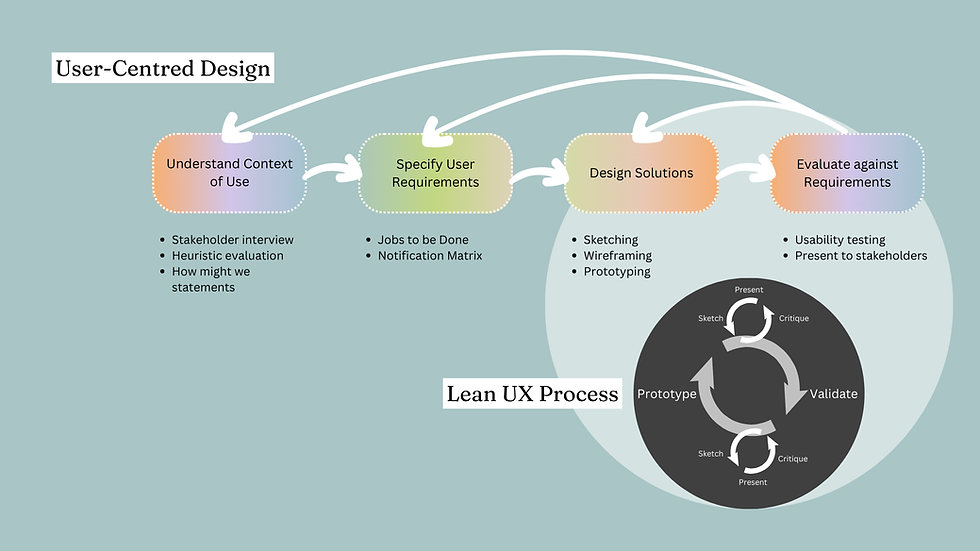
The Design Process
For this project, I used the User-Centred Design process, while adding to the design solution stage using the Lean UX approach in order to complete final designs and presentation at the end of the 7 weeks.
.png)
Understanding the Context of Use
To better understand the existing pain points in the HSBC Deceased Estate Process, we conducted stakeholder interviews to capture internal perspectives on the most pressing concerns. This was followed by card sorting and synthesis.
From then, a heuristic evaluation was conducted on the users initial touch point with the bank and its process.
Why?
By focusing on Jakob Nielsen’s 10 Usability Heuristics in this way, the evaluation identified key areas for improvement that would be used for the design moving from a webpage to a mobile app:
-
Reducing cognitive load by simplifying legal jargon.
-
Enhancing navigation with collapsible sections and progress indicators.
-
Improving accessibility for users with varying levels of digital literacy.
Heuristic | Issue | Recommendation | Severity |
|---|---|---|---|
Help & Documentation | No direct link to customer support, making it difficult to seek clarification. | Add a "Need Help?" section with live chat, contact details, or a call-to-action for customer service. | High |
Help Users Recognize & Recover from Errors | Users may struggle to determine which documents are needed for their specific case. | Provide an interactive questionnaire that tailors document requirements based on user responses. | High |
Aesthetic & Minimalist Design | Overwhelming amount of text without visual hierarchy, making scanning difficult. | Improve readability with bullet points, clear headings, and whitespace. | High |
Flexibility & Efficiency of Use | No search function for specific terms or user needs, making information retrieval difficult. | Add a search bar or quick links to frequently asked sections. | High |
Recognition Rather Than Recall | Users must scroll extensively to find relevant steps, with no shortcuts. | Use collapsible accordions or a step-by-step wizard to break down content logically. | High |
Error Prevention | No safeguards to prevent users from missing critical steps (e.g., required documents). | Include inline validation or dynamic checklists to confirm necessary documents before submission. | High |
Consistency & Standards | The layout and terminology are inconsistent with HSBC’s general website design. | Align the design and wording with HSBC’s main UX patterns to improve user familiarity. | Medium |
User Control & Freedom | n/a - page is single scroll, no steps with pdf attachments | n/a | n/a |
Match Between System & Real World | Uses financial/legal jargon (e.g., "Probate," "Letters of Administration") without definitions upfront. | Provide inline explanations, tooltips, or a FAQ pop-up for key terms. | High |
Visibility of System Status | No real-time assistance or progress indicator for users navigating long content. | Introduce a progress bar or collapsible sections to help users track their reading and actions. | Medium |
Additionally, we built upon findings from a previous research team, which had identified two major systemic challenges affecting both users and internal teams: inefficient communication and manual data handling and documentation complexity.
Leading to four key assumptions that directly aligned with business goals.
01
Lack of Transparency & Visibility
-
Users had no clear way to track their application status, leading to frustration and uncertainty.
-
The management process lacked a unified system, making it difficult for both users and HSBC employees to monitor progress.
03
Manual & Time-Consuming Processes
-
The existing process was slow, inconvenient, and heavily reliant on manual documentation, increasing workload for both customers and employees.
-
Frontline staff could miss critical documentation, causing delays.
-
Overseas customers faced additional challenges due to document submission barriers and lack of remote support.
02
Inefficient Communication & Inconsistent Support
-
The primary mode of customer communication was through physical letters, delaying responses and updates.
-
Branches acted as intermediaries between customers and back-office teams, leading to inconsistencies in information delivery.
-
Inconsistent staff training resulted in varied levels of service, leaving customers with different experiences depending on location.
04
Accessibility & Compliance Barriers
-
A lack of multilingual support created difficulties for non-English speakers.
-
Regulatory and compliance pressures further complicated the process, requiring extensive verification and approvals.
-
Diverse user cohorts with varying digital literacy and accessibility needs were not adequately considered in the existing system.
Defining User Requirements
These insights highlighted the need for a centralised, transparent system that streamlined communication, automated document tracking, and accommodated diverse user needs. These findings directly informed our How Might We (HMW) statements and design approach.

HWM create a simple-to-use system for alters and notification to keep users informed.
HWM simplify and clarify the document submission process to increase the visibility of submitted documents, and provide insight about the status of these documents.
HWM design a hybrid solution that accommodates both digital-first users and those who prefer in-person interactions?
To ensure the solution addressed user pain points effectively, we used the Jobs to Be Done framework to define key user goals. These statements helped us align design decisions with user needs, business priorities, and HSBC's operational requirements.
Research Finding | Job to be done | Aligned HMW Statement | Design Implication |
|---|---|---|---|
Timely Notifications and Reminders for Pending or Missing Documents | As a user, I need proactive notifications about pending or missing documents so I can take action quickly and avoid delays. | HMW ensure users receive timely and clear notifications without feeling overwhelmed? | Categorised notification messages by urgency, ensuring users receive critical updates at the right time. |
Handling Multiple Submission Methods for Documents | As a user, I need to know how to submit documents—digitally, by mail, or in-branch—so I can choose the most convenient method and ensure they are processed correctly. | HMW design a hybrid solution that accommodates both digital-first users and those who prefer in-person interactions? | Designed a document submission guide that provides clear instructions for each method with estimated processing times. |
Tracking Document Submission and Review Status | As a user, I need a clear way to track my submitted documents so that I know if there are any issues or additional actions required to complete the process. | HMW provide real-time updates on document status to reduce uncertainty and anxiety? | Introduced a progress tracker with real-time updates and status indicators. |
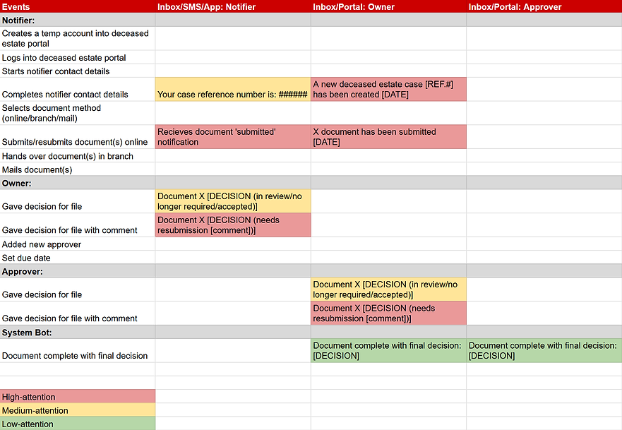
One of the biggest concerns was the lack of transparency in document tracking and submission. To address this, we designed a rough notification system that aimed to give direction as to the intended real-time updates while ensuring users were not overwhelmed with excessive messaging.
Iterations and Validation
Exploring early concepts through rapid iteration.
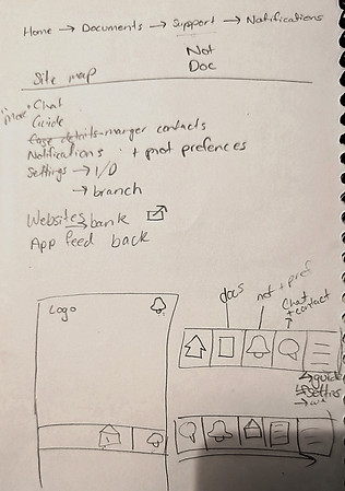
Considering the tight timeline of this project, sketches were underway looking at the initial screen of the app. Which were very quickly developed into high fidelity wireframes.
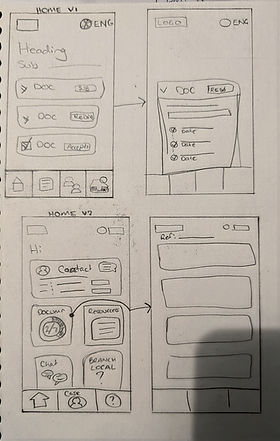

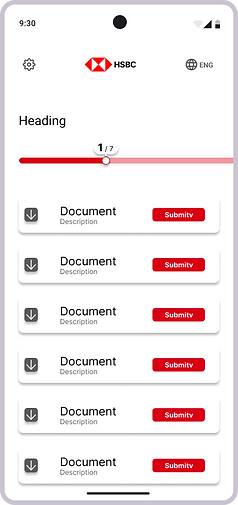
Portal-Home-v1
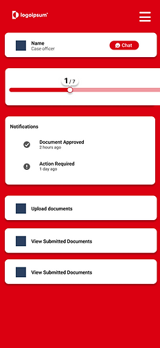
Portal-Home-v2

Portal-Home-v3
Initial user feedback showed a design preference for version 3 of the homepage, however version 2 appealed more to the business goals.
Some issues here was that a journey customer was not properly defined in order to address key pain points. So sketches were revisited, specifically detailing the specifics for the flows for 3 main types of new users; digital, physical (combining mail-in and in-branch) and professional (being solicitors who may act as representatives of the estate opposed to personal users—family members).
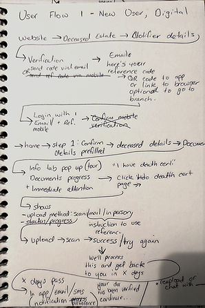
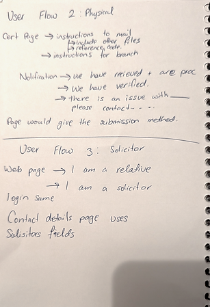

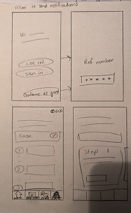

Feeling more confident with the user journey flow, I went straight into a first round of usability testing on mock-ups using external critiques for initial feedback. The mocks-up were designed to be higher fidelity so users could really grasp the flow of this very unique process. Most users hadn't gone through a process like this, so it was crucial most of the content is visualised for the best feedback.


.png)


Write a title here. Click to edit and add your own.
This is a paragraph area where you can add your own text. Just click “Edit Text” or double click here to add your own content and make changes to the font. It's a great place to tell a story about your business and let users know more about you.