Ecommerce Mobile Web Homepage Redesign
Redefining the digital storefront for a luxury homecare brand

Role
UX/UI Designer
Tools
Figma, Miro, Lyssna
Team
Solo, bootcamp project
Timeline
May– July 2024 (9 weeks)


Survey & Insights
To understand Nontre.co’s target audience, we conducted a screening survey combining demographic questions and ordinal scales. We received 14 responses, revealing:
-
Laundry Care: Cleaning ability ranked highest, followed by price and eco-friendliness.
-
General Home Cleaning: Eco-friendliness was prioritized, followed by cleaning ability and natural ingredients.
-
Body Care: Natural ingredients were most important.
-
These insights shaped the homepage content order, ensuring the most relevant information was prominently featured.


Interviews
To understand user perceptions of Nontre.co’s homepage, I conducted 2 in-person and 1 remote user interviews with questions designed to looking into 3 main objectives:
-
brand impression
-
confusion and/or hesitation points
-
functionality issues
Positive First Impressions: Users found the design clean and elegant, but lacked clear navigation to products, impacting conversions.
Brand Perception Gaps: Users associated the brand with quality and eco-friendliness but not luxury, which was a key brand goal.
Functionality Issues: The Review tab and other overlayed icons obstructed category navigation, creating confusion and frustration. In addition, discount popups immediately upon site entry was considered intrusive and irrelevant at that stage.
These findings informed the idea to complete a product category exercise and solidified clearer brand position and navigation as a result.
I would say eco-friendly. I wouldn't say luxury so much.
Female, 55, desktop.
..because they’re online, I don’t know what it smells like (referring to scent names).
Female, 29, mobile.
Looks like a regular spray and wipe. Looks plastic nothing premium about it.
Female, 29, mobile.
They look like they're based in the USA.
Female, 56, mobile.
Couldn’t see much of the product categories with that Review tab...is that meant to be there?
Female, 56, mobile.
This is what I'd like to see, 'not tested on animals'. I like that. Why isn't more obvious?
Female, 29, mobile.
Personas
To form a deeper understanding of our users' motivations and frustrations I created 3 personas for each of our user segments. Based on user interviews and surveys, these personas guided design decisions and validated features by ensuring they resonated with real user goals and values.

OLIVIA
‶Small acts, when multiplied by millions of people, can transform the world.″ — Howard Zinn
Basic Info
Age:
Location:
Job:
Education:
28
Melbourne, Australia
Marketing Coordinator
Bachelor's Degree
Motivations
-
Support local, ethical brands
-
Reduce plastic waste by choosing sustainable packaging.
-
Find products that are safe for sensitive skin and allergy-friendly.
-
Learn about clean living practices.
Frustration
-
Overwhelmed by greenwashing
-
Too many brand options.
-
Overwhelming to compare products due to complex ingredient lists.
-
Lacks trust in new brands without transparent sourcing or ingredient information.
Needs
-
Values transparency with environmental impact.
-
Brands that educate rather than just sell
-
Certifications and third-party verifications (e.g., cruelty-free, carbon-neutral).
-
Clear and simple shopping experience to avoid decision fatigue.
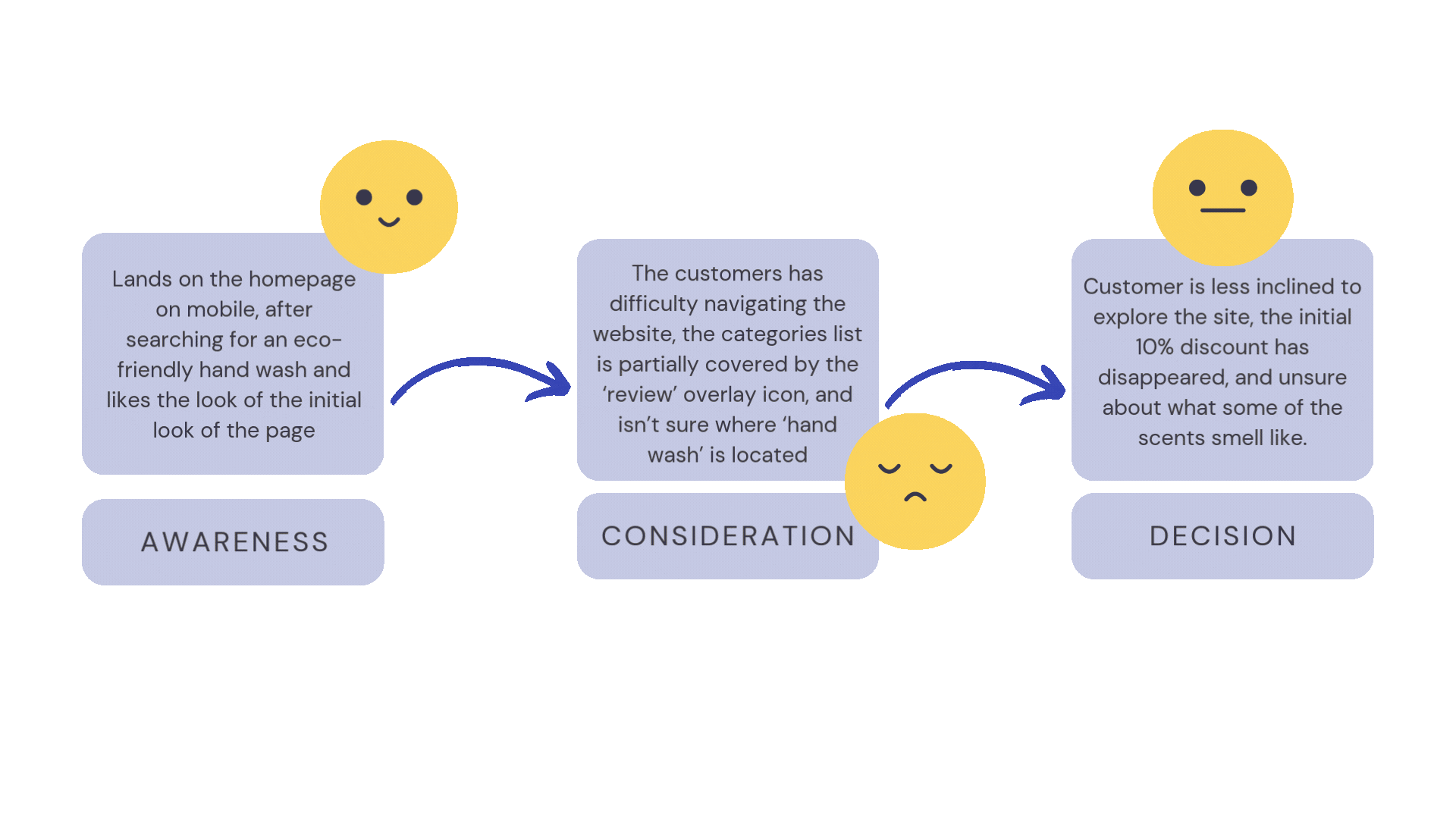
Customer Journey
Using the Jobs To Be Done framework to scope and contextualise the customer journey. This was mainly because the project scope was limited to just the homepage, so the journey itself was quite short. I still wanted to be specific in how a users may behave, feel and react in those mirco flows.
Sketches
Beginning with low-fidelity sketching, it became the basis for me to quickly brainstorm what ever idea came to mind at the time. I wanted to see how much I could make a homepage standout functionally, not just with a fresh sleek new design. I really loved the idea of the hover-over 'helper' text within a scrollable hero banner. But how to make it work for mobile...

Product categories sketch

Home screen banner idea

Home screen sketch
Wireframes
I wanted to test how I could make the 'helper' overlay text idea work on mobile, and found some potential using these translucent icon dotters.
Unfortunately there wasn't a strong response for this with some quick internal feedback. In addition, I was lacking the time to build this design feature within Figma, so I turned to a new approach and had a couple of responses through Lyssna to assess the new design.
Other internal feedback included:
-
the green in the banner didn't feel luxurious enough
-
the feel gave off a spa business as opposed to ecommerce
-
there were concerns that descriptions weren't visible until hovering or clicking on the dots and felt that it could be distracting.

Wireframe 1
UI Design
After resolving usability issues, I moved on to designing the final screens in Figma, focusing on:
-
Modern, luxurious aesthetics to elevate brand perception while maintaining a clean, minimalist style.
-
A fresh, light color palette to highlight the brand’s eco-friendly ethos.
-
Visual hierarchy to emphasize key value propositions like eco-friendliness, quality, and scent options.
Interactive 👆
Homepage Prototype - Mobile
Usability Testing
Despite good intentions, it was time to move onto new designs that had more practicality, and understanding from a business perspective, a design that is more time-practical to implement. I conducted 2 usability tests with the new high-fidelity wireframe design (below), revealing the following insights:
-
Legibility: some legibility issues with circular icons, background colours and font.
Solution — Quick and easy fix to update these areas. Opted for cleaner, simpler colours, larger font size, reduce text overlays, overall more simpler design.
-
Too casual: some of the font choices has made the site feel "too casual for a luxury brand... the font on 'signature fragrances' section looks better than 'shop our best sellers'.
Solution — Interestingly enough, those two sections were using the same font, the 'signature fragrances' just had it bolded. Again, simple fix to keep things a bit more consistent and returning back to sentence case as opposed to lower case (intention was to match the brand logo).

Loved the room-based menu.
Icons were unclear.
Prototype 1

Text too small
Lower case and font weight seemed too 'casual.
Prototype 1 continued
‟
"I absolutely love the 'Shop by Room' and 'Shop by Fragrance' features. It's something we hadn't thought of internally but makes so much sense for the consumer. Your insights have opened our eyes to how the homepage can declutter while showcasing more products without overwhelming customers. Amazing work, Sarah!″
— Stakeholder feedback.
Learnings
This project was an excellent exercise in balancing a complex brand identity and usability. It highlighted the importance of:
-
User-centred navigation design, especially when introducing new categorization methods like 'Shop by Room' and 'Shop by Scent'.
-
Consistent branding to maintain luxury perception while educating users about eco-friendly benefits.
-
Emotional engagement through sensory storytelling, addressing the challenge of describing scents in a digital format.
Quick Wins
Understanding a whole homepage redesign and implementation require significant time, cost and energy here were some of my suggested quick wins to directly improve user experience:
-
Relocate overlay icons so they're not obstructing content
-
Include a members login on the mobile page (currently missing on mobile but available on desktop)
-
Delay the new customer discount OR offer once a user has viewed a specific item for longer than 2 seconds – in testing users found the immediate discount popup when they've haven't seen any of the products felt cold, intrusive and irrelevant.
Next Steps for the Design
Ideally, I'd like to have given the prototype more interactive design elements, such as hover effects animated transitions, and video, to help support product exploration. I also think the design itself can be simplified to create an even more luxurious feel. Restricting myself to utilising existing assets from the brand, meant that I was still following an existing design style and was difficult to break away. I would suggest different image assets to showcase products amongst images that reflect the scents promoted by the brand.